Did you know that 88% of users won’t return to a website after a poor experience? In today’s digital world, great UI/UX design isn’t just nice to have—it’s essential. A beautiful app is no longer enough—it must also be seamless, intuitive, and deliver real results. Design can create new added value in the product life cycle: design brings more users, more satisfaction, and even a business.
What is UI UX Design?
At a glance, UI (User Interface) design and UX (User Experience) design may seem similar, but they play very different roles in product development.
- User Interface (UI): UI is short for User Interface, and it deals with the ‘look’ of the product. By contrast, UI is everything the end user can see or directly interact with, such as buttons, icons, spacing, and the system’s interface. A great UI gets you involved with the product & how to use it as it was meant, with no confusion, no frustration.
- User Experience (UX): The user’s interaction with the product is the user’s experience. It’s not beautiful, but the product is clean, straightforward, pleasurable, and efficient. It’s understanding their desires, behaviors, what they hold dear, and how they feel. In other words, good UX is the difference between all right and great user satisfaction, retention, and loyalty.
A Simple Analogy:
Think of a car: UI is the dashboard, steering wheel, gear system—everything you can see and touch. UX is how smoothly the car drives, how comfortable the ride feels, and how easy it is to reach your destination.
Significance of UI/UX in the Success of Digital Product
Suppose the whole being of a digital product is based on UI/UX. According to Gomez, 88% are unlikely to return to a site if they had a bad experience. A great UI ensures the user can get to wherever in the product they want, and a great UX makes them want to hang out and do stuff while there.
Key Statistics on the Impact of UX
- According to Gomez, 88 percent of users are less likely to revisit a site after a negative experience.
- Where UX is concerned, for every 1$ dollar invested, businesses are receiving back a whopping approximate 100$, according to Forrester’s research.
- Shopify mentioned that 70% of shopping carts are abandoned due to bad UX, and Baymard Institute found the same percentage.
- Forrester also estimates that good UI can increase website conversion rates by 200%.
- These figures show the significant impact of good UI/UX design on user behaviour and business results.
Understanding the Difference: UI vs UX
Defining Roles, Duties, and Goals
What UI Designers Focus On
UI designers design a project’s aesthetics. They design good-looking, easy-to-use, and easy-to-get-around layouts for buttons, icons, colours, fonts, and the general appearance.
What UX Designers Focus On
UX designers are interested in dissecting the user’s journey. They ensure the product meets users’ requirements, solves issues, and is a pleasure. Their jobs include researching, designing personas, mapping user flows, and testing usability prototypes.
How UI and UX Work Together
UI and UX work together to make a helpful and appealing product. While UI designers are responsible for ensuring the product looks and feels nice, UX designers are responsible for ensuring that it’s easy to use and serves the user’s needs.
Good vs Bad UI/UX Design Examples
Good UI/UX
Clean UI, easy to navigate, consistent design elements and flows, simple task flow. One-place actions: Users know where to click and can get the job done without any confusion.
Bad UI/UX
Too much stuff distracts the eye on the page, pages take too long to load, and the navigation doesn’t make sense. Users get lost and frustrated and may leave the site.
Core Principles of Great UI/UX Design
- Simplicity and Clarity: Simple design is the best. Designers remove the extraneous details and focus on what’s essential to making products usable. This reduces cognitive dissonance and allows users to navigate by instinct.
- Accessibility and Inclusivity:Design should be for all people, including those with disabilities. This includes using fonts that are easy to read, high contrast, and ensuring the product can be accessed with a keyboard or screen reader.
- Consistent Design Language: If design patterns are consistent, users can easily understand how to use a product. For example, buttons should look the same throughout, and navigation elements should be in the same place on each page for a smooth experience.
- Visual Hierarchy and Layout: Visual hierarchy leads users through the interface, organizing elements in order of importance. Through techniques such as size, colour, and placement, designers can ensure the most critical aspects are noticeable and that users understand where their attention is likely to fall initially.
- Responsive and Mobile-First Design: The world is using more mobile devices than ever before. Design for mobile first and work out to other screen sizes from there. The mobile-first approach ensures that your website’s experience is still great, regardless of the device.
- Feedback, Error Prevention, and Recovery: Designs should tell the user they have successfully acted, for example, a successful notification after a form is submitted. Also, avoid the errors to avoid errors by raising signals when users make mistakes (e.g., partial fill) and provide good feedback to recover from these errors.
- Feedback Loops and Iterative Design: Design work is continuing. In the meantime after the product’s launch, the designer should keep collecting the user feedback to refine the design. Feedback loops support designers in the decision on how to maintain and develop the design over time.
The UI/UX Design Process Explained
User Research and Empathy Mapping
Understanding who your users are is the first step of the design process. User research is how we learn about what our users do, need, and are pained by. When creating a product, you must know how your users think and feel, and what motivates them, and this is why with empathy mapping.
Personas & User Journey Map
Personas address end-users and their needs. A user journey map demonstrates how users go through a product, with the pain points to be improved.
Information Architecture and Wireframing
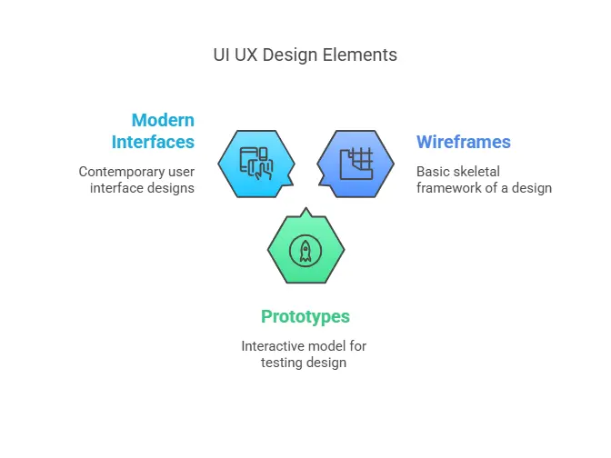
Content is organized in a way that makes sense to users, as prescribed by the information architecture. A wireframe is a rough sketch or blueprint of a design that shows the functionality’s skeletal structure, not necessarily the product’s look.
Prototyping and Interactive Mockups
The personas universe represents the end-users with their requirements. The user journey map illustrates how a user interacts with a product or service at all stages and identifies pain points to modify.
Usability Testing and User Feedback
Usability testing is putting your product in front of people and watching them use it. In this manner, other defects that were not previously valid can be accepted. User feedback suggests valuable insights for improvement.
Developer Handoff and Implementation
Designers export these files when the designs are finalized, and developers will use them to build the product. Designers and developers need to cooperate to make the design work properly.
How UI/UX Design Impacts Business Metrics
Enhanced User Engagement and Time-on-Site
A good UI makes users use, a great UX makes users want to use. This means better engagement and retention.
Higher Conversion and Retention Rates
Great products make it easy for users to do a desired act, like a purchase or signing up for an account. Businesses can increase conversion rates while retaining users by enhancing the experience.
Lower Bounce Rates and Increased Loyalty
The easier and more enjoyable an experience you create for people, the longer they will stay on the site and will come back in the future. This will result in fewer bounces and greater loyalty to your site from your visitors.
Brand Credibility and User Trust
This clean, professional look provides credibility, and that builds trust. Consumers will be more likely to trust a provider that offers a professional-looking and clean product.
Real-World Metrics from Top Brands
The world’s best brands, such as Apple and Airbnb, have experienced real gains in business metrics from their work in the UI/UX design space. Forrester, for instance, reports that for every $1 spent on UX, businesses receive a return of $100. This well underlines the value of design to business for revenue and success.
Designing for Engagement vs Usability
Designing User-Friendly Interfaces
A user-friendly interface is provided so first-time users can easily use the product and exercise tasks. No factors cause trouble from the beginning, including excellent signposts, straightforward progress, and helpful prompts.
Creating Emotionally Engaging Interactions
Design and Modelling for Games and Interactive Media. There is no share of the wallet for the heart. The minute, such as fun animations or personalized experiences, can make or break whether users stay interested.
Use of Microinteractions, Animation, and Storytelling
Microinteractions are small, fun animations that help improve user experience. Animation can provide feedback or help direct users’ attention to a task. Storytelling can then be overlaid to make the experience more memorable and emotionally driven.
The Role of Visual Identity and Branding
Compelling visuals can strengthen a brand’s communication and render the product more recognizable. Brand strength: A good balance of logos, colors, and typefaces maintains the brand and causes users to remember it.
UI/UX and SEO: The Overlooked Connection
Page Experience and Core Web Vitals
The page experience is a set of web vitals that aims to reflect a user’s real-world experience interacting with a web page. At the same time, the Core Web Vitals is a subset of page experience that also focuses more on aspects of page experience as a ranking factor that Google finds generally more critical. Google measures page experience with Core Web Vitals. PageSpeed, performance, and visual stability – the things that are important to SEO and user experience. Optimizing the UI/UX allows those metrics to be improved, influencing search results.
Navigation, Structure, and Internal Linking
User & Search Engine Friendly Architecture well-structured site with straightforward navigation, will not only help visitors find the information they want, but it will also help search engines discover it. This is wonderful for SEO and user experience/navigation.
Mobile Optimization and Load Speed
Mobile Compatibility This theme is mobile-friendly and responsive to make your website look beautiful on all devices. Faster load times create a better user experience and better search engine rankings.
Reducing Bounce Rate Through UX
A good UI results in reasonable bounce rates and more time spent on the website. When visitors have a good time, they stick around and navigate more pages.
Accessibility and Semantic HTML
Ease of Access and Semantic HTML. The header is the section where you will put the head code of your HTML, and this section comes from the head tags. Courses, Blogs, Communities. There are online courses to teach you UI/UX on sites like Coursera and Udemy, blogs that cover services you need to know, and communities like Dribbble and Behance where you can connect with other designers.
Common UI/UX Mistakes to Avoid
Confusing Navigation or Architecture
UI/UX Design: How to design for efficiency and simplicity. Through design, UI/UX is one of the most critical aspects of an application or website. It’s the map that users use to navigate your website or app. If it’s unclear how to navigate or if the site’s architecture is confusing, users cannot find what they’re looking for. This irritation is one of the reasons that people give up and leave the site.
Inconsistent Design Patterns and UI Elements
Confusing design patterns can confuse the user and make it difficult for them to understand the product. Design uniform UI elements for a seamless user experience.
Overuse of Animations or Visual Clutter
There are limits on how much animation and how many elements on a page that users can handle. Keep the sample animations to a minimum and don’t overdesign it.
Ignoring Accessibility Guidelines
Designers risk making assumptions without conducting user research or testing. Make sure to test with real users before shipping your design.
Skipping User Research or Testing
Without user research and testing, designers risk making assumptions that may not align with user needs. Always get feedback from real users before finalizing the design.
Best UI/UX Tools for Designers
Design Tools: Figma, Adobe XD, Sketch
Designers create interactive prototypes and layouts using multilayered design tools like Figma, Adobe XD, Sketch, etc. These tools are must-haves for UI design.
Prototyping Tools: InVision, Marvel, Framer
InVision, Marvel, and Framer help designers create prototypes that mimic user behaviour. This is real-time collaboration and simple sharing with all the stakeholders!
User Testing: Maze, Hotjar, UsabilityHub
These UI tools help designers collect user feedback. These platforms offer heatmaps, surveys, and other features that provide valuable insights into how users interact with their designs.
Collaboration & Handoff: Zeplin, Miro, Notion
Zeplin, Miro, and Notion let designers collaborate with developers and other teammates. They facilitate the handoff to ensure that your designs are accurately brought to life in development.
Latest Trends in UI/UX Design (2025 Edition)
AI-Driven Personalization
AI is being leveraged to provide more personalized user experiences. By interpreting the behavior and content interests of its users, AI can recommend personalised content and products or services for each user.
Voice and Gesture Interfaces
Voice commands and gestures are becoming more prevalent. They enable people to engage with products without touching a screen, making these interfaces ideal for hands-free or multitasking use cases.
Minimalist and Neumorphic Design
Minimalism emphasizes simplicity and clean lines, while neumorphism utilizes soft shadows and subtle details to generate a 3D effect. Both design styles were created with visually appealing and easy-to-use designs in mind.
Advanced Microinteractions and Motion
More complex microinteractions and animations make using a product more entertaining and engaging.
Ethical and Inclusive Design
Designers are becoming increasingly mindful to make their products inclusive to all, no matter your walk of life.
Case Studies and Real-World Examples
Case Study: Airbnb – UX that Builds Trust
Airbnb’s UX design focuses on trust and ease of use. Their clean layout, simple navigation, and emphasis on user reviews have made it one of the most trusted platforms for booking accommodations.
Case Study: Duolingo – Gamification at Scale
Duolingo uses gamification to make language learning fun and engaging. Progress bars, levels, and rewards keep users motivated and coming back for more.
Case Study: Spotify – Seamless Music Discovery
Spotify’s UI/UX design focuses on making music discovery easy and personalized. Based on user preferences, their recommendation system keeps users engaged and helps them discover new music.
Case Study: Zomato – Hyperlocal and User-Friendly UI
Zomato’s UI is designed to provide a user-friendly experience. It offers personalized recommendations based on location and preferences, and its intuitive interface makes it easy to search for and order food.
Getting Started in UI/UX Design
How to Learn UI/UX: Courses, Blogs, Communities
UI/UX can be self-taught by taking online courses on Coursera and Udemy, reading design blogs that track current design trends, and joining communities like Dribbble and Behance where you can network with other designers.
Essential Skills and Mindsets
To deliver the type of design you want, you need a combination of technical and soft skills. You will thrive if you bring creativity, problem-solving, empathy, and fluency in design software such as Sketch, Figma, and Adobe XD.
Building a Beginner-Friendly Portfolio
If you’re new to web development, it would be best to use Svelte in conjunction with a simple front-end application. Your portfolio is a way to present your best work, but it also shows your design thinking. When constructing your portfolio, concentrate on the projects that best represent your competence in skills and creativity.
Practicing with Real-World Projects
The best way to learn is through action. Work on real projects, whether your own, volunteer work, or freelance gigs, to get experience and build on your portfolio.
Career Paths and Job Roles in UI/UX
There is a wide range of career paths in UI/UX design, such as interaction designer, product designer, and UX researcher. The landscape is ever changing, providing unique opportunities to focus as a designer in some design domains.

Tips for Beginners in UI UX Design
- Start with design thinking principles.
- Follow top designers on platforms like Dribbble and Behance.
- Practice wireframing and create prototypes using Figma or Adobe XD.
- Take free or paid courses from platforms like Coursera, Udemy, or master UI/UX skills in our Full Stack Development course offered by Tutedude.
- Build your portfolio with mock projects and case studies.
Conclusion
UI UX design isn’t just a phase in development —it’s the core of building successful digital products. Explore more blogs on UI, UX, and frontend design in our Web Development section to continue learning with us. A well-crafted design enhances usability, drives user satisfaction, and delivers tangible business results.
If you want to create a high-performing product or website, invest in UI UX design from the beginning. Your users (and your bottom line) will thank you.
Have a project or idea you’d like to bring to life? Let’s talk UI/UX. Reach out today!


