

Introduction
Have you ever wondered why some websites are so appealing that you can’t resist making purchases? Many organizations use colour strategies to influence customer behaviour, as colours significantly impact user perception and actions. For developers and UI/UX designers, understanding colour theory for UX/UI Designers is essential for enhancing user experience and engagement.
Colour theory for UX/UI Designers choices directly affect consumers’ emotions and drive interaction. For instance, green signifies nature and growth, while white represents clarity and creativity. By understanding these meanings, designers can strategically enhance the user experience. Thoughtful colour palettes also promote accessibility and usability.
In this blog, we will explore the core concepts of colour theory, including colour wheels, harmonies, and psychological effects. Implementing these principles can help designers create visually engaging and user-friendly websites.
What is Colour Theory?
Colour Theory is a study of the synergy of colours and how they influence our perceptions and intuition. Colour Theory is a complete kit for designers to effectively curate colour palettes for a brand. This toolkit supports designers to choose colours that thoroughly define and synchronize with the intended mission and objective of the brand. At the crux of this theory lies the concept of a colour wheel i.e. a visual illustration of colour combinations and associations. The colour wheel specifically categorizes the colours into primary i.e. red, blue, yellow; secondary i.e. green, orange, pink; advanced i.e. mixture of primary and secondary. Moreover, it illustrates fundamental colour associations i.e. complementary colours, analogous colours, and multilateral colours. This guide is designer-oriented i.e. helps designers choose colour combinations and balance the essence of the organization.
Concludingly, it is crucial to comprehend that this theory plays a crucial role in maintaining a consistent visual tone across all elements on the web page. By consistently following these principles, web designers can promote branding activities, enhance user engagement and establish a well-defined colour scheme for the brand.
Key Elements of Colour Theory
Understanding the core components of designing paves the way for the creation of perfectly balanced web designs. These components work collaboratively to create alluring visual experiences. Let us explore these key components: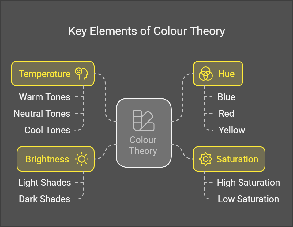
- Temperature: One can generally categorize colours into warm tones (reds, oranges, and yellows), neutral tones (greys, browns and beiges) or cool tones (blues, greens and purples). As the names denote, warm colours tend to evoke delight, energy and zeal; whereas neutral colours denote elegance, harmony, and flexibility.
- Hue: In simple terms, hue refers to the original, pure colour, namely blue, red, and yellow. It forms the base of any other colour which may be differentiated from one another.
- Saturation: Saturation refers to the purity of hue. Generally, high saturation are colours vibrant while low saturation colours appear to be more subtle and dull. Therefore, it is recommended to adjust the saturation of colours to dramatically modify the tone of the design and the elements.
- Brightness: Value or brightness refers to the darkness or lightness of any colour. It is widely understood that adding white to any colour creates tinted shades while adding black creates darker shades. Therefore, brightness plays an important role in visual hierarchy or gradual progression.
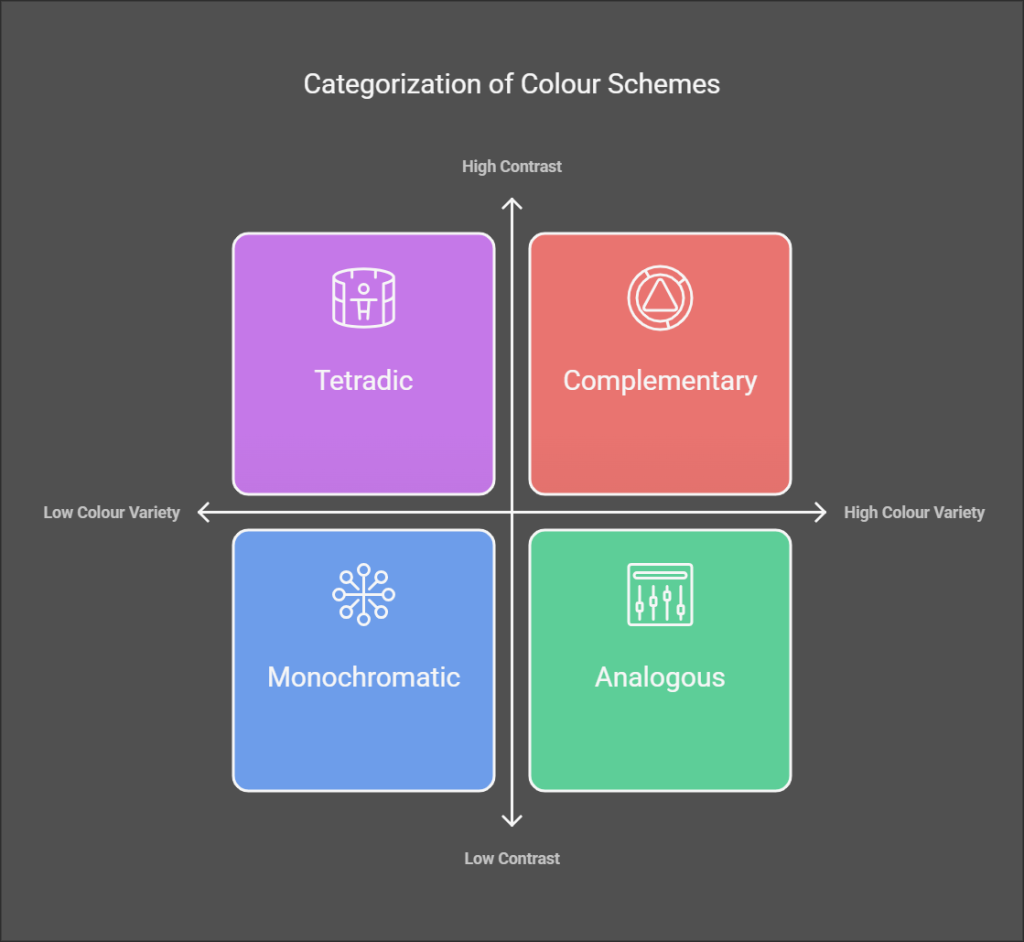
Types of Colour Schemes
Let us explore the riddles to visualisable words with the types of colour schemes:
- Monochromatic: Congruous to its name, the monochromatic scheme includes various shades and tints (light to dark) of a single colour. Its general tendency is unification and elegance; however, it lacks contrast and variety.
- Complementary: Complementary colour combinations are generally placed opposite to each other on the colour wheel. These combinations complement each other while upholding their hues. It can generally be used to create an ombre effect (can be used for fashion designers and their websites).
- Triadic: As the name suggests, it is a combination of their colours in an equilateral triangle shape on the colour wheel. Typically, these colours establish a sense of harmony in the designs.
- Tetradic: A combination which includes two pairs of complimentary colour schemes on the colour wheel which creates a classy and balanced look.
- Analogous: These colour combinations include colours which are proximate to each other on the colour wheel. This combination creates a balanced and unified look in website designs.
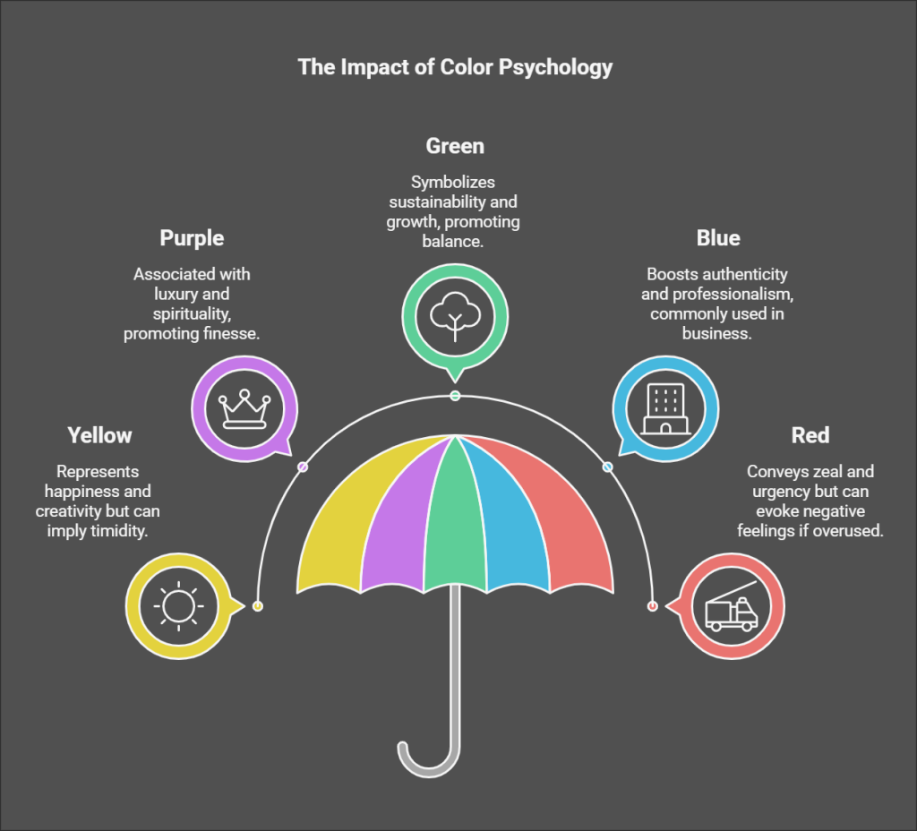
The Psychology of Colour
We are surrounded by colours all around us which is why they play a dynamic part in our choices. Therefore, understanding the psychology of colours and their associations is important to redesigning balanced and indicative interfaces. Let us now explore the cardinal psychology of commonly used colours:
- Yellow: Yellow often denotes novelty, happiness, and positivity. It is the colour of spring and improves creative skills. However, in other cases it can also be considered as a colour of timidity, basis the context in which it is implemented or used.
- Purple: Purple colour is often associated with luxury and spiritism. This colour tends to promote feelings of finesse and imperiality amongst the users.
- Green: Green is often associated with sustainability and growth and can promote a sense of balance and serenity. It is generally used in designs concerning the environment, sustainability, and nature.
- Blue: Blue is widely used as the primary option in business and professional websites. This colour boosts authenticity and professionalism among the users.
- Red: This vibrant hue is connected with zeal, urgency and excitement. It aims to draw the immediate attention of the users. It can therefore be used to categorically draw the attention of the users to important information. However, it is to be used with great caution as it can promote negative feelings such as depression and anger.
Accessibility and Colour Choices
Although, in the present-day websites are designed to cater to the needs of all users including users with visual impairments. In such circumstances, it is important to select accessible colour options to generate a sense of trust amongst the users. Colour Contrast i.e. significant visual difference between the text and background colour, is generally maintained to improve the digital accessibility of the websites. Accordingly, meeting accessibility standards such as Web Content Accessibility Standards (WCAG), helps in incorporating legible web content and design. Lastly, using differentiated or complementary colours, patterns and textures can increase the usage of websites by visually impaired individuals as well.
How to Effectively Use Colours in UX/UI Design
Developers should initiate the website development journey by designing the colour palette. Designers can use neutrals to improve user readability while avoiding distractions and increased bounce rates. However, it is important to use contrasting colours for text to promote legibility for the users. Buttons, call-to-action and offers should deploy attention-grabbing colours such as red or orange. Lastly, it is important to note that maintaining a consistent colour palette throughout the website promotes brand identification and resonance amongst the users.
Colour Mistakes in UX/UI Design and How to Avoid Them
Well, understanding the psychology of colour schemes is not enough to thoroughly implement it. It is important to forecast the following mistakes to avoid disruption of any sort in the organizations-
- Overuse of bright flashy colours tends to backfire as it creates visual overload.
- The usage of text and patterns along with connected colours is imperative to avoid user boredom.
- Non-curation of a brand colour scheme before web designing often leads to confusion and delays brand identification.
- Lastly, using only low-contrast colours creates a monotonous look making the users disinterested in the content/ information displayed.
Best Practices for Choosing Colours in UX/UI Design
At the outset, the developer shall begin with designing a brand’s colour scheme to help users resonate with the brand in the long run. Limiting the colours in the brand scheme helps create a visually appealing look and can guide users’ interests and engagement. Consistent device testing ensures that the brand colour scheme is effectively incorporated. Most importantly, it is primarily important to consider the accessibility of websites in light or dark environments to further enhance usability and distinguishability.
Top Tools for Creating and Managing Colour Palettes
Developers can make use of several powerful tools to curate and manage a brand’s colour palettes. However, the two most predominant tools include –
- Adobe Colour– which allows developers to general colour schemes basis certain colour rules; and
- Material Design Colour Tool– which offers pre-designed palettes and thorough accessibility checks. These tools guide the developer. Basis their experience, towards experimentation of colour combinations and creating user-friendly platforms.
Conclusion
Not just another Instagram-oriented aesthetic, colour theory moves way beyond that. Colour Theory is an influential tool for influencing user engagement and utility. Colour Theory aims at influencing consumer choices by deploying the colour-emotions strategy. By comprehensively understanding the aforesaid concepts along with their timely implementation, designers can curate exceptional websites. Colour Theory aims to strike a balance between creativity and utility. Communicative colour choices enhance readability and accessibility while upholding brand identification activities.
Do you want to understand the nuances of web development and colour theory? Join our exclusive UI/UX design course wherein we take you deep down into colour theory and practical implementation techniques, Register and connect with us today!
Bookmark it or save this article for your future use and share it within your network to increase awareness.


